SIA Rebranding
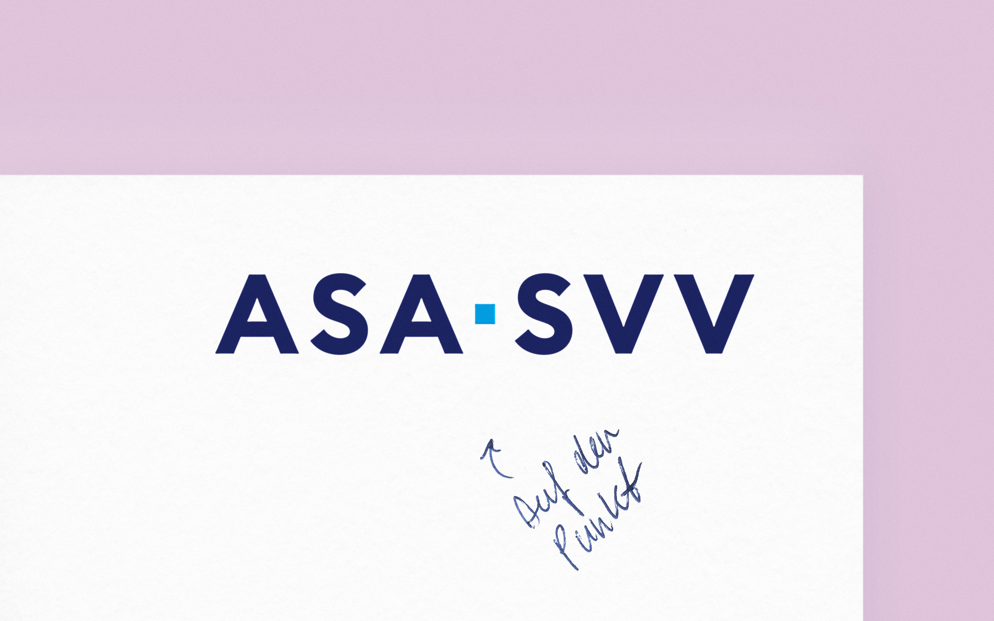
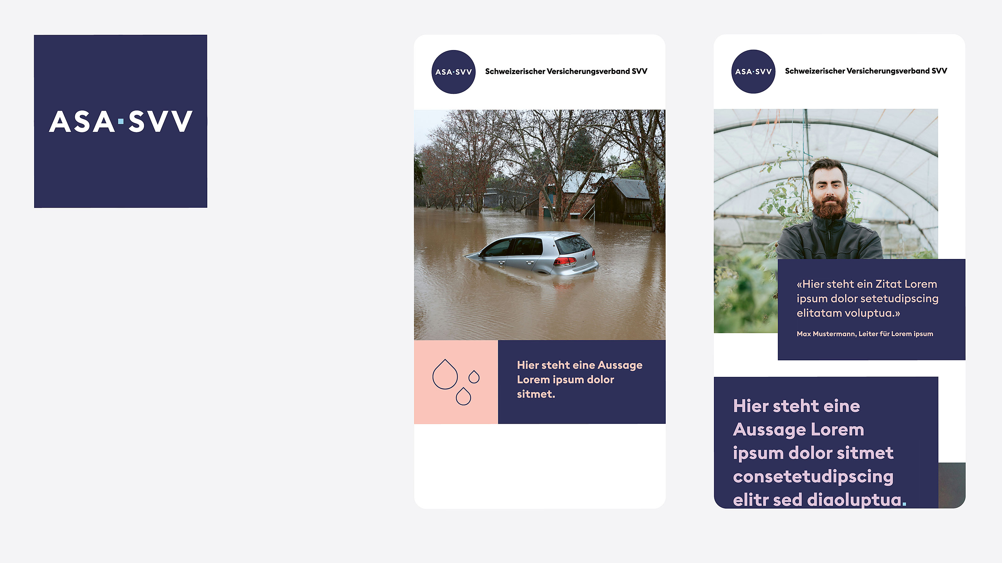
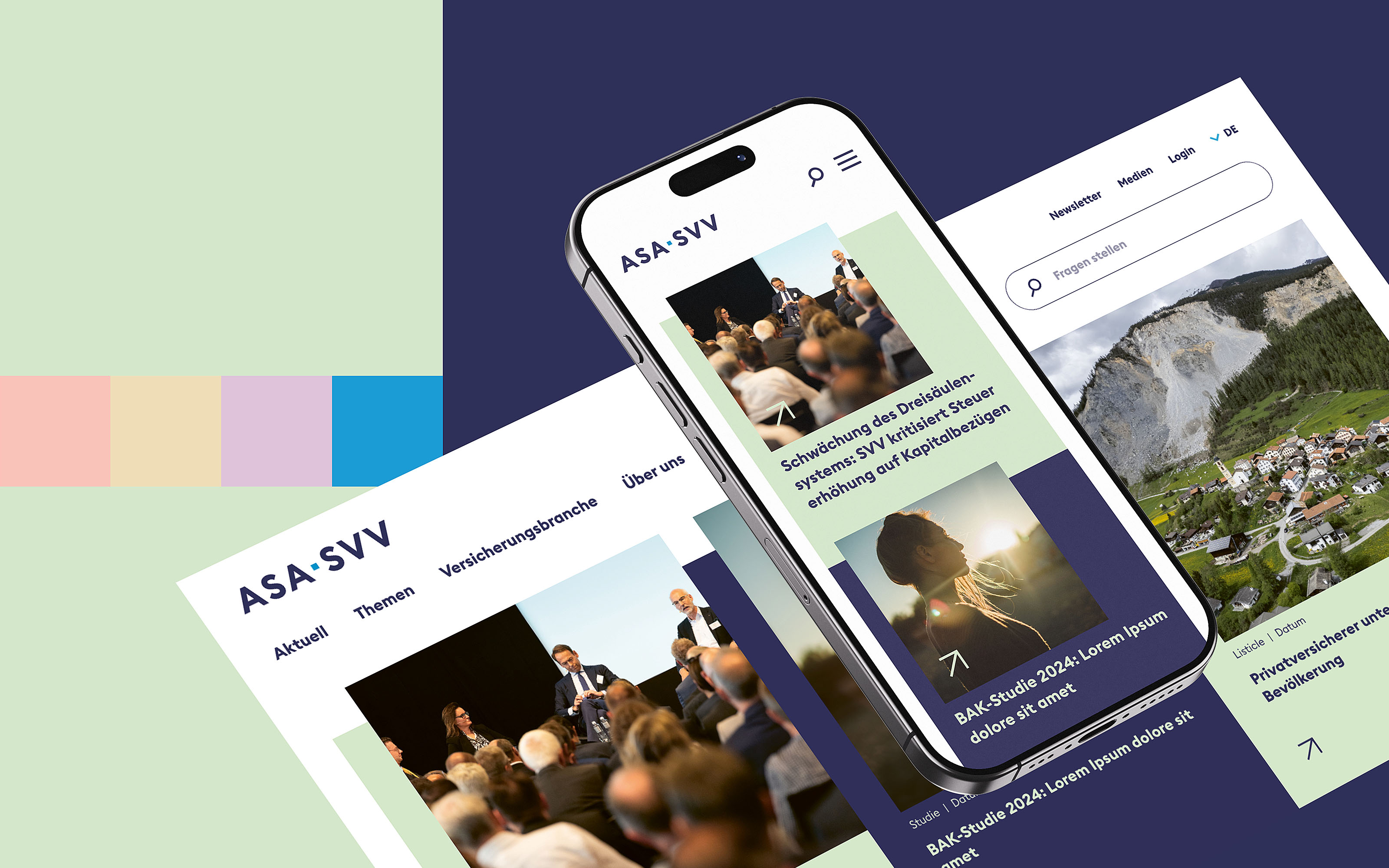
A comprehensive rebranding positions the Swiss Insurance Association SIA as a relevant, high-profile voice for the industry – with a brand identity that exudes conviction, clarity, and modernity.
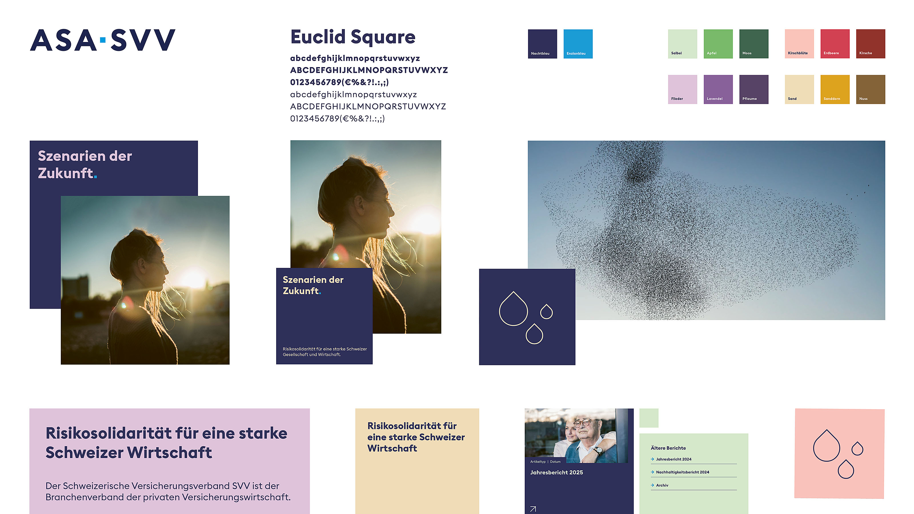
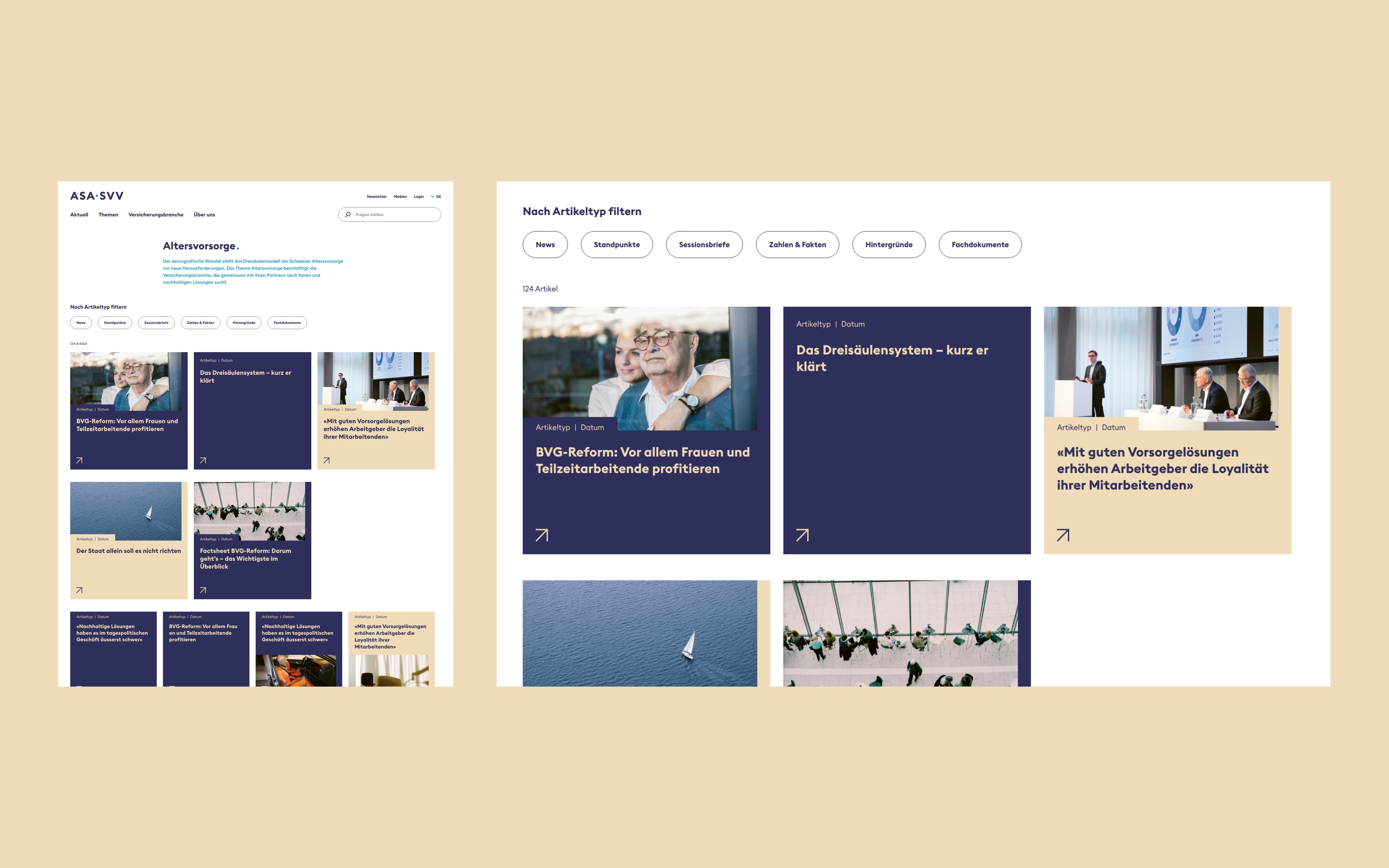
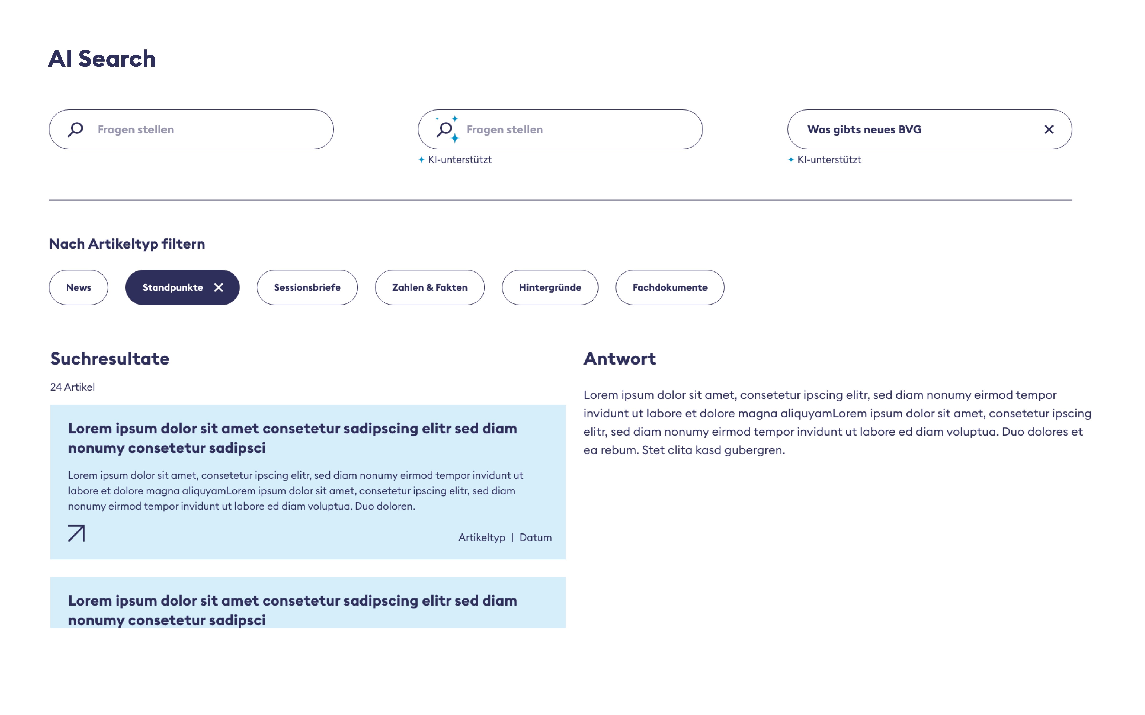
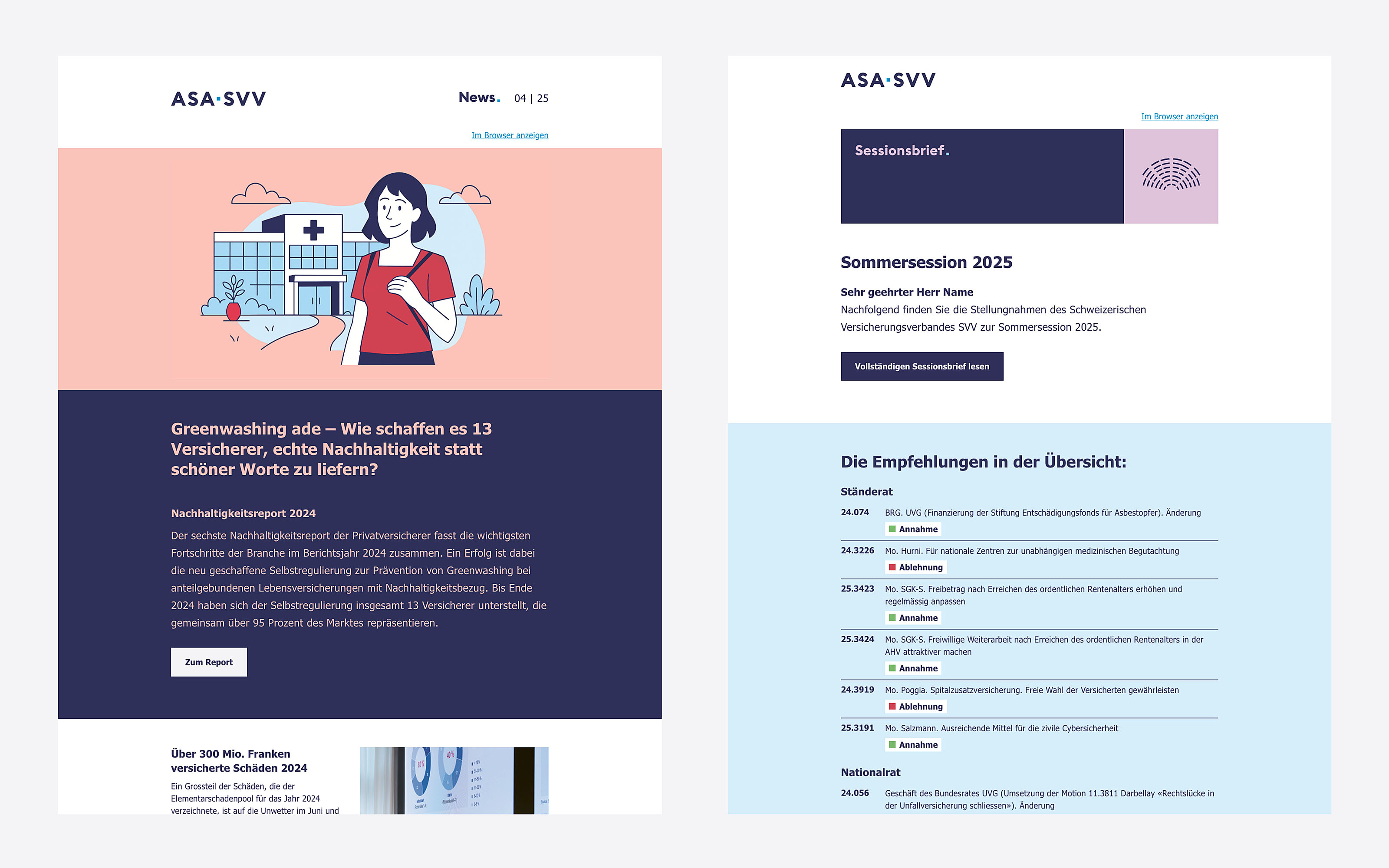
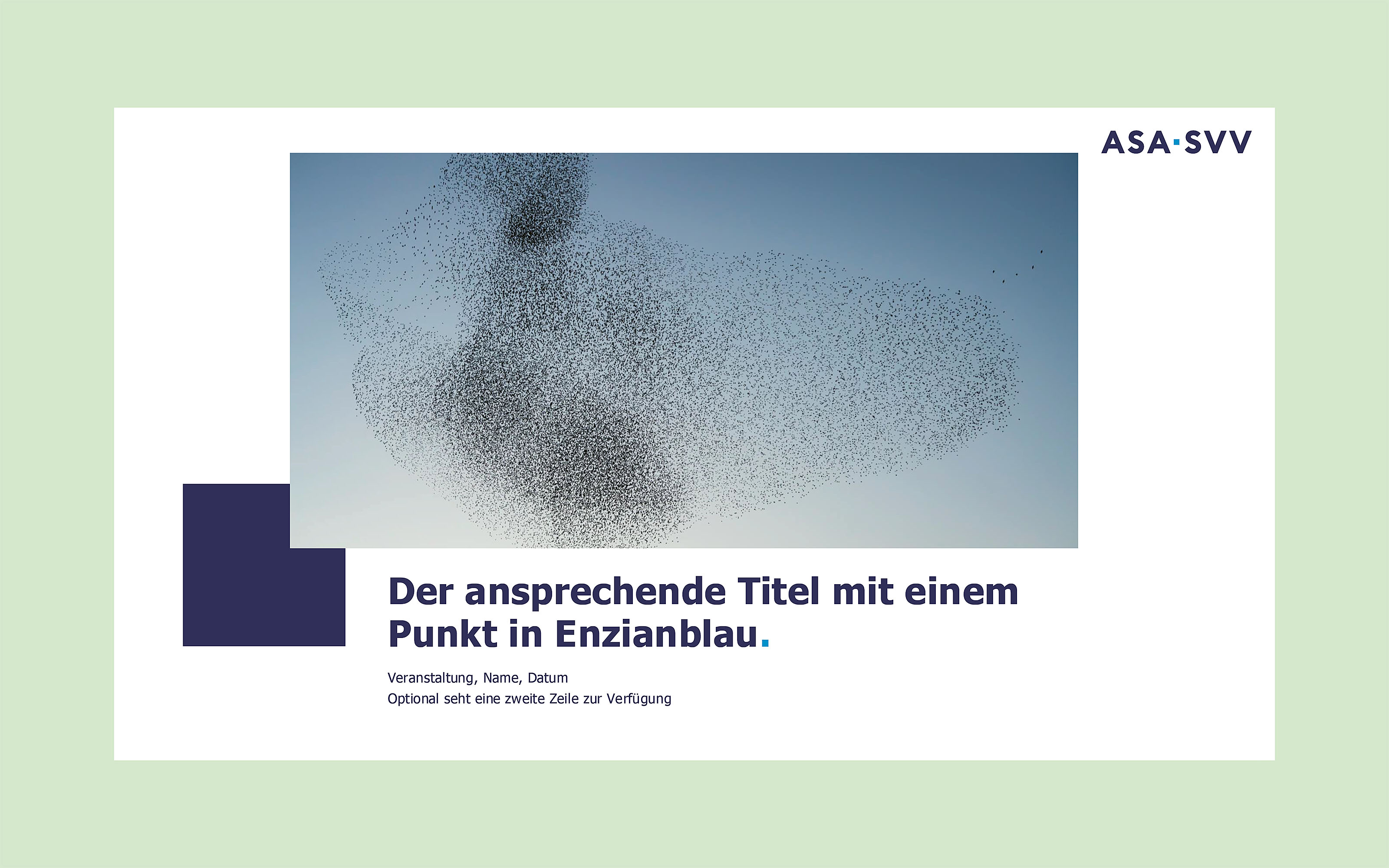
The square, as a central brand element, represents clear standpoints and shapes both the new logo and the secondary elements of the corporate design. A vibrant color palette and consistently applied surfaces bring energy and functionality to the brand's appearance. The newly conceptualized website – developed in partnership with the web and mobile agency Liip – showcases the association as a high-profile knowledge carrier: An information-driven page structure, an integrated AI search, and an intelligent article-type filter ensure that users immediately find what they are looking for. Several collaborative workshops with the association and the development team laid the shared foundation for this.
Period
2025 – 2026
Role and responsibilities
Development of logos & entire design language. Design principles & brand guidelines. Workshop moderation. UX/UI design. Handover to development
Tools
Illustrator. InDesign. Photoshop. XD. ChatGPT
URL